
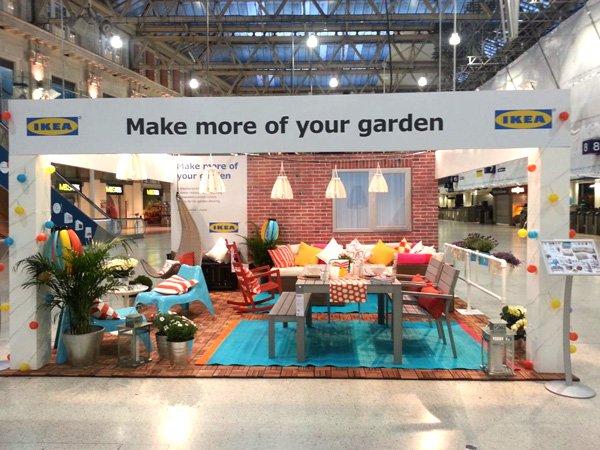
Pop Up Ikea
To tie in with Ikea’s ‘Make more of your Garden’ their new pop up at Liverpool Street Station.
Apparently 800,000 commuters pass through the station every day.
Doing things differently
In Dresden VW build (and sell) cars … but rather differently to how you might think.
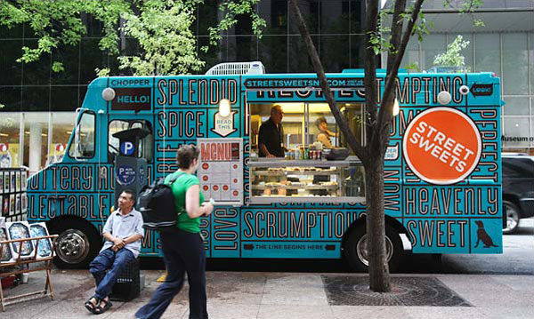
A Food Truck Compendium
Spring is in the air and festival season not long around the corner.
Here’s a few food trucks to whet the appetite. All brands whatever their purpose could follow this model for some pop up retail.
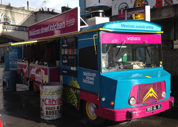
Wahaca Food Truck, Southbank London
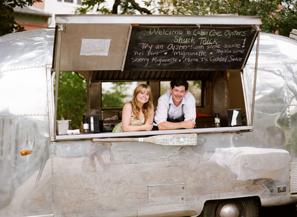
Shuck Truck, the obligatory converted Airstream, but this time selling oysters. Originally from Coolhunting, more on their website cabincoveoysters.com
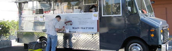
The Marination mobile’s Big Blue, website here marinationmobile.com
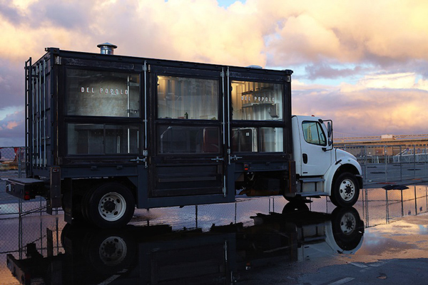
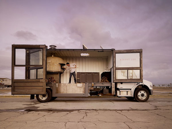
Del Popolo Food Truck, a wood burning oven on wheels, originally from the very excellent Fox is Black.
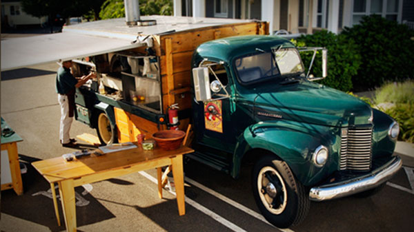
Big Green Truck Pizza Company, more images on their website biggreentruckpizza.com
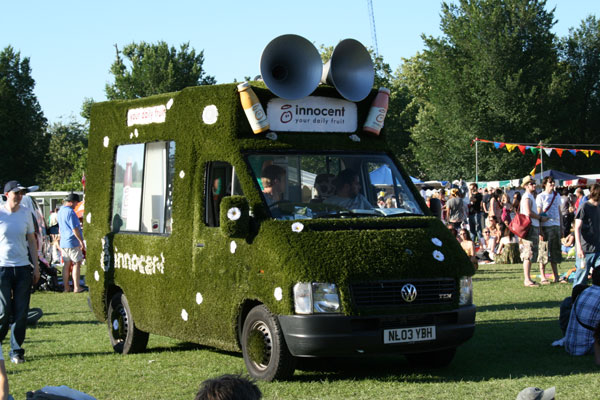
The Innocent van, is this still going, not sure?
There’s a whole load of type driven design trucks, and even a Food Truck Tracker, who knew!
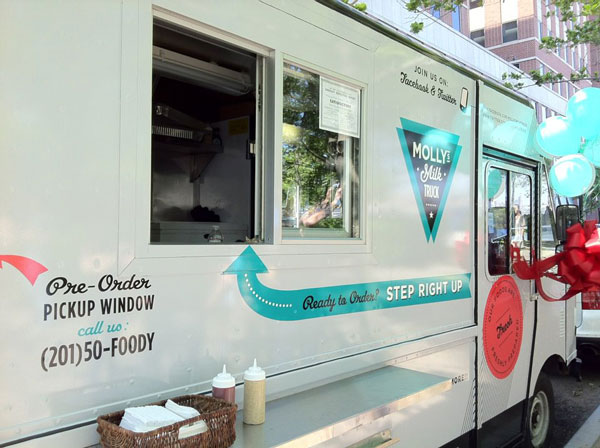
And last but not lease Molly’s Milk Truck, website her mollysmilktruck.com
Beurre & Sel
Really like this shop (and website) especially the product display, simple is always best and it’s always good when your packaging creates it’s own point of sale.
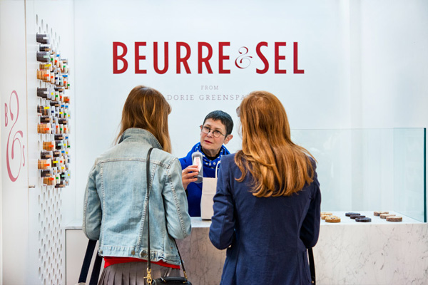
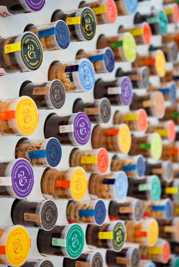

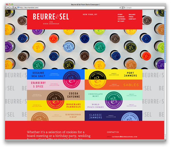
More pictures on their website beurreandsel.com
2013 is Emerald!
This year’s colour is Emerald, or Pantone® 17-5641 if you prefer.
a lively, radiant, lush green
The brights always come to the fore when money is tight and talk of recession filters through the airwaves.


More detail, mood boards and colour trend history on the Pantone site
Season’s Greetings
Apologies for the total lack of posts on here and thanks to all of you who keep visiting.
Normal service (or even improved) will resume in the new year, in the meantime here’s a festive image from the Liberty atrium, splendid gold chains, an idea no doubt we will be borrowing for our own homes.

Fred Perry at Westfield
A new store for Fred Perry at Westfield Stratford City.
The centrepiece is a locally made sculpture of 32 brass leaved that viewed from the front creates the signature Fred Perry laurel wreath.


Designed by BuckleyGrayYeoman
QV Melbourne Car Park
Some big bold car park graphics, simple and effective in a clean space.


Not a million miles away from this project also in Melbourne.
Images from Latitude, originally spotted on Enviromeant
Thorntons – New Store Design
Towards the end of last year our new concept design for Thorntons opened in Birmingham.
More bling, more product talk and more emphasis on Thorntons enormous product range.
The perimeter (shown here in the Christmas scheme) uses a magnetic paper background to provide an easily changeable backdrop for promotions and events. Self selection is more prominent as is a more elaborate gift wrapping service. Lighting is much more detailed and ranges from overhead ceiling rafts to shelf level product lighting.
More blurb on our website.


Cioccolato
A pastry boutique specialising in in custom desserts for special events.
Very clean, nice quirks (especially that table) and a space where the product can really stand out.


