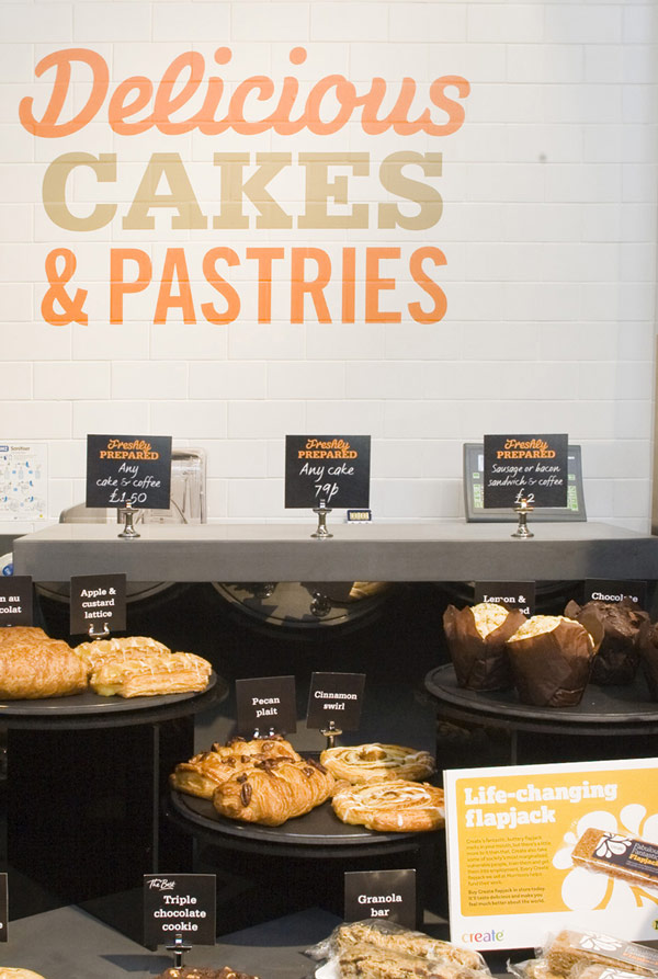
Vintage Tesco
Even Tesco is getting in on the vintage act. Their store at Goodwood Revival harks back to the 60’s complete with retro packaging and hairdo’s.
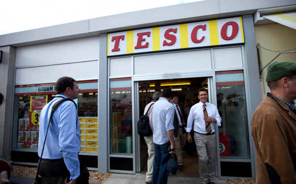
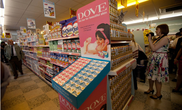
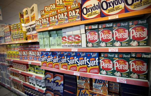
Many more photos on Tasteologie and the Daily Mail Online
Meltin’ Pot
We were recently sent some info about this new dark and mysterious jeans flagship store in Riccione, Italy, apparently the heart of summer vacation land in Italy and the place for new trends.
According to Meltin’ Pot:
The pilot flagship Denim store is the first example of a Meltin’Pot jeans branded store, and houses the complete denim collection for men and women. All the fittings and furnishings embrace and emulate “denim world” style, “raw” and industrial, using materials such as wood and steel but with mixed with modern and innovative technology. A massive, “Meltin’Pot” Lifestyle video wall structure transmits real time video content related to collections, advertising campaigns, events.
The first Meltin’Pot denim store is also a key marker within the new brand’s new “retail” strategy – a pilot project that anticipates the forthcoming openings of additional Meltin’Pot stores both within Italy and worldwide.
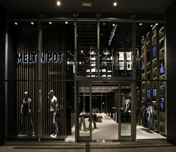
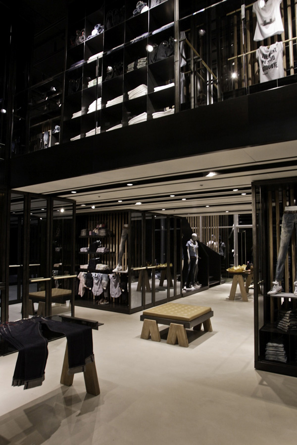
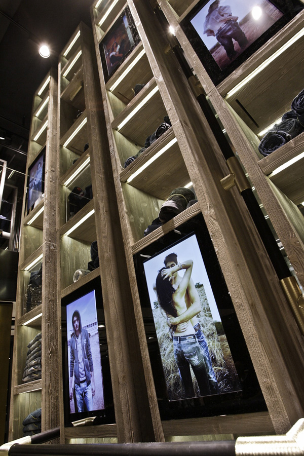
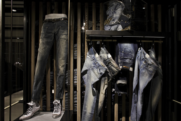
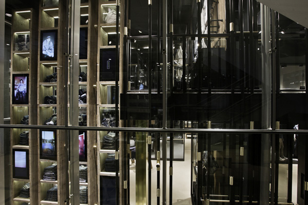
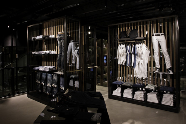
Nice video too on the Meltin’ Pot website … www.meltinpot.com
Can you tell navy blue from black?
According to the PSFK Future of Retail Report …
67% of customers who try on items buy them. Only 10% of customers make a purchase that they haven’t tried on. That’s why stores have begun to make changing rooms more attractive to customers.
Lighting is of course the key element in changing rooms, if you can tell navy blue from black you know the lighting is working. Then come the add ons. Mary Portas when launching her new shop for women is going to have fitting rooms with a choice of lighting modes.
Neither do changing rooms have to be static tucked away in a corner. Bloomingdales in Santa Monica have installed pods that retract into the ceiling.
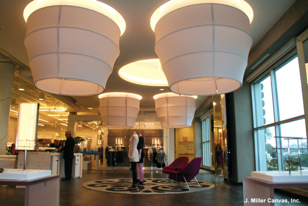
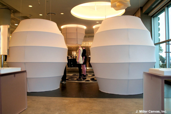
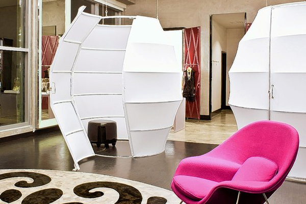
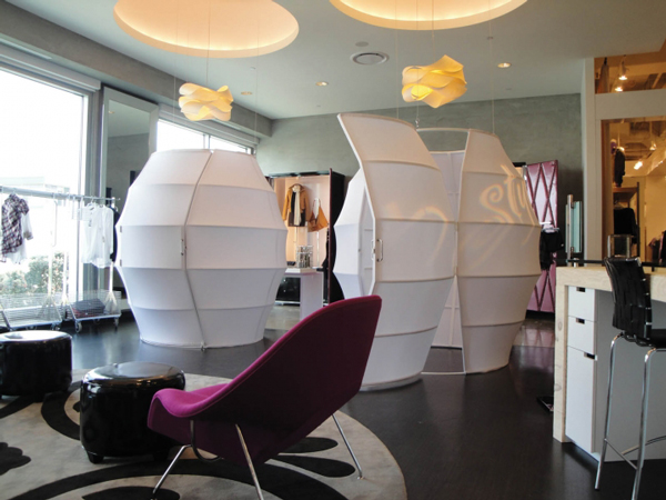
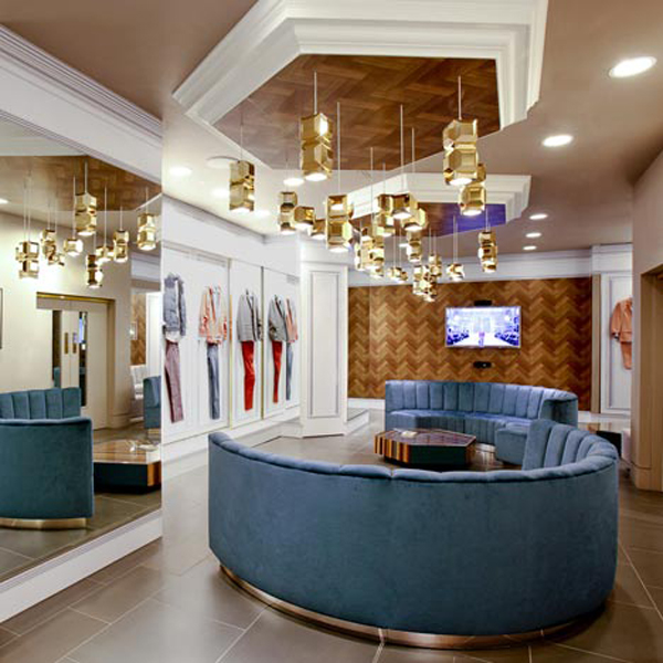
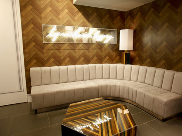
Also of note in the same ‘retailtainment’ vein, the Topman personal shopping suite by Lee Broom.
More reading for changing rooms:
Specialty Fabrics Review about Bloomingdales
Flavaboom
A new frozen yogurt shop in Manhattan, New York. Very clean simple and with some really great features, particularly the large seating ‘pods’ with mirrored backs and the illuminated far yogurt dispensing wall.
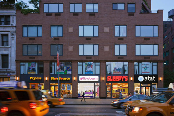
Flavaboom Fascia
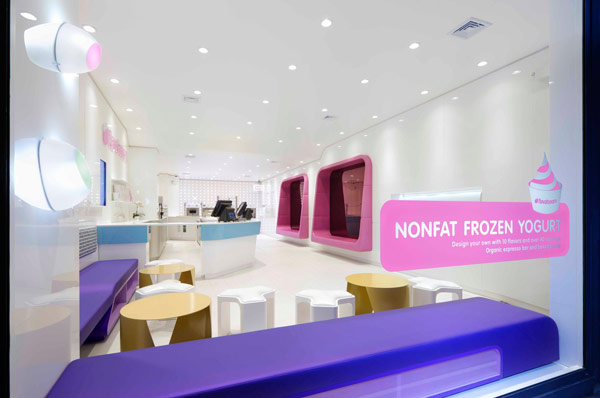
View through the window
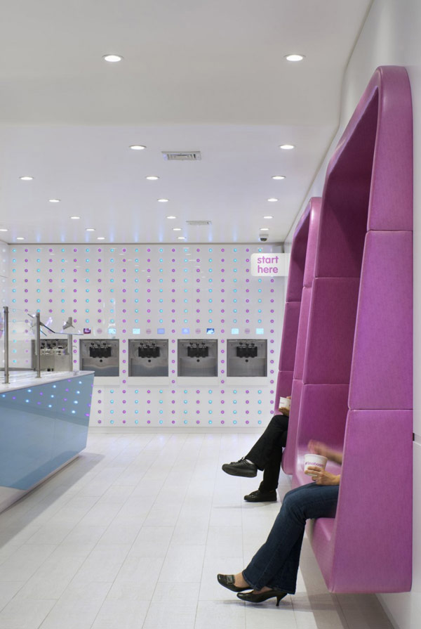
Seating pods mounted on the wall and far wall yogurt dispenser
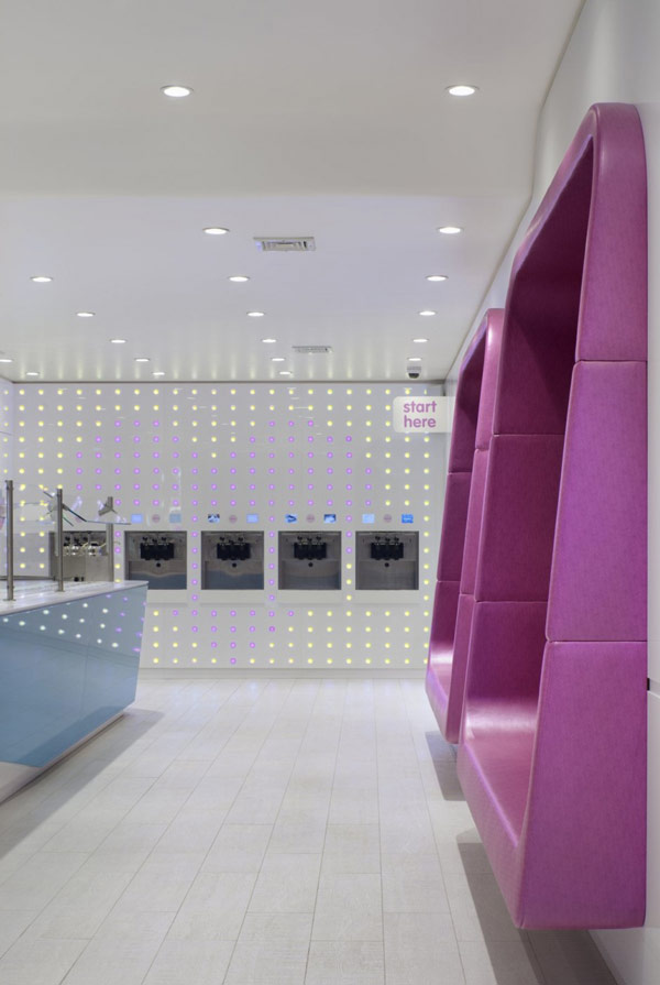
Far wall with changing lighting
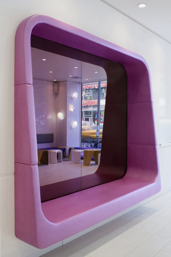
Mirrored back on seating pod
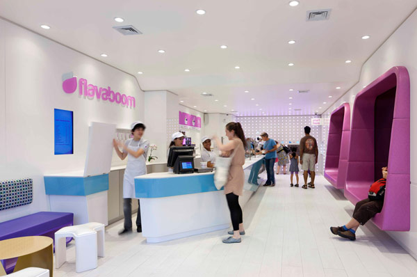
Interior, very open, very clean
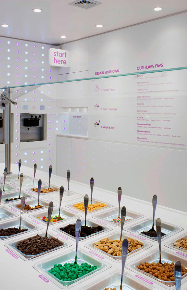
DIY instructions are very straightforward, like the little 'Start Here' projecting sign
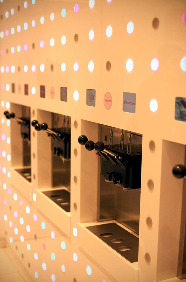
Close up of the dispensing wall for choosing your yogurt flavour
Originally from Contemporist.
M Local by Morrisons
A ‘fresh street corner supermarket’ for Morrisons new M Local concept in Ilkley West Yorkshire.
Of particular note, a large use of fresh (some might say Asda) green and a very architectural girder or two that run through the space.
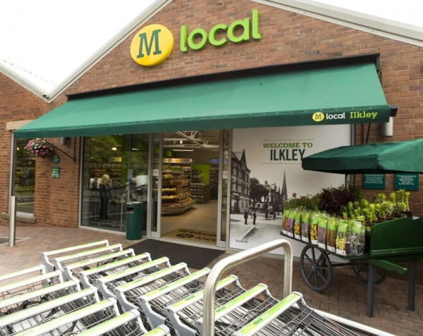
Fascia with entrance 'you are here' graphics and plant barrow to the right.
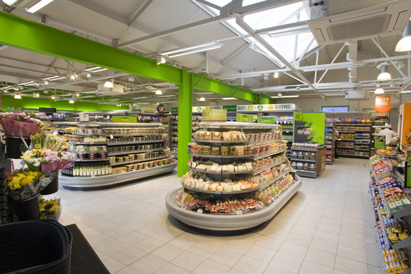
Interior with the big green girder
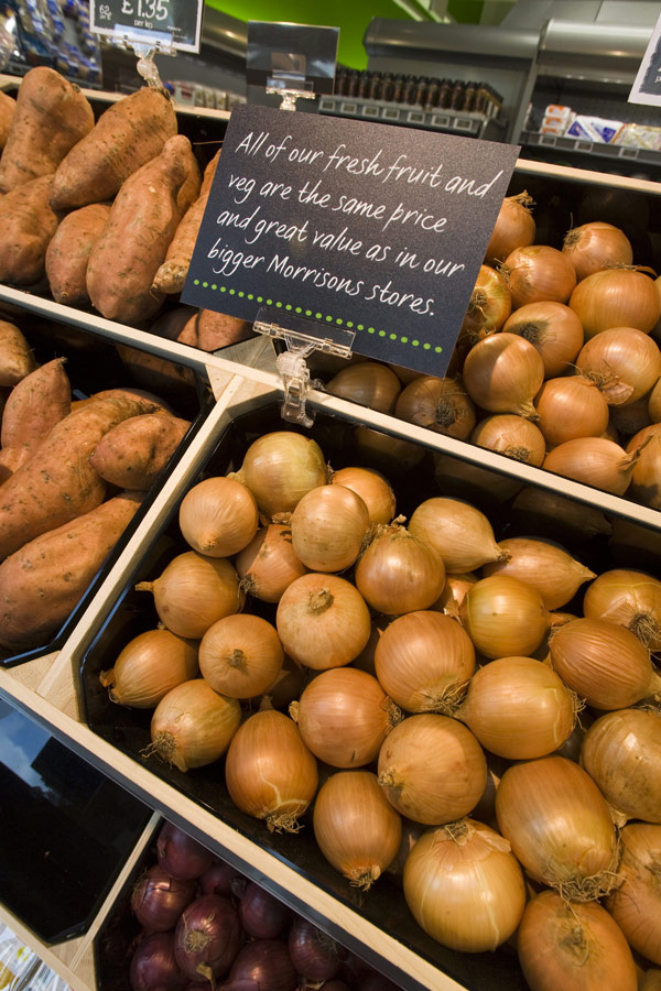
'Market fresh' produce with ubiquitous hand written blackboard graphics, one day someone will actually write these kind of things by hand
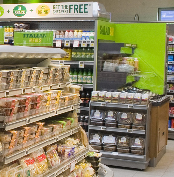
Salad bar close up
Spotted on LSN Global and Popsop and Fitch
Cath Kidston in York
Or an alternative title is ‘Retail is detail’
A few quick snaps from a visit to Cath Kidston in York, really illustrating that consistency through the store creates a great retail experience. Just take a look at some of the detail and love that’s gone into the setting out of the shop.
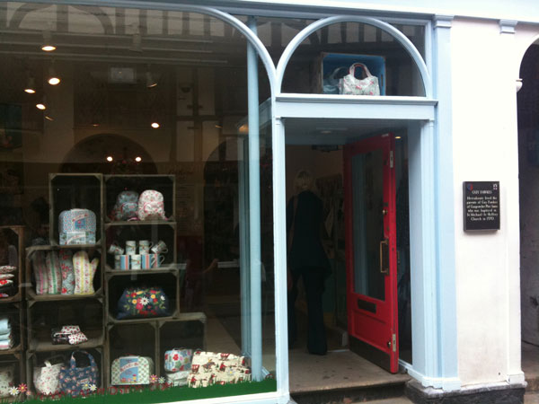
The store entrance, apparently the shop is on the site of a house where Guy Fawkes parents lived! Isn't it nice to have the door open to welcome you in?
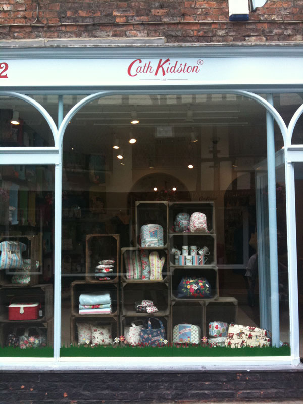
The window display. Simple and effective, crates with brightly painted insides make the perfect modular display system. Note the one over the door.
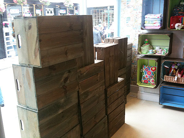
The reverse of the window display. Perhaps a dress could have been hung here, just nit picking!
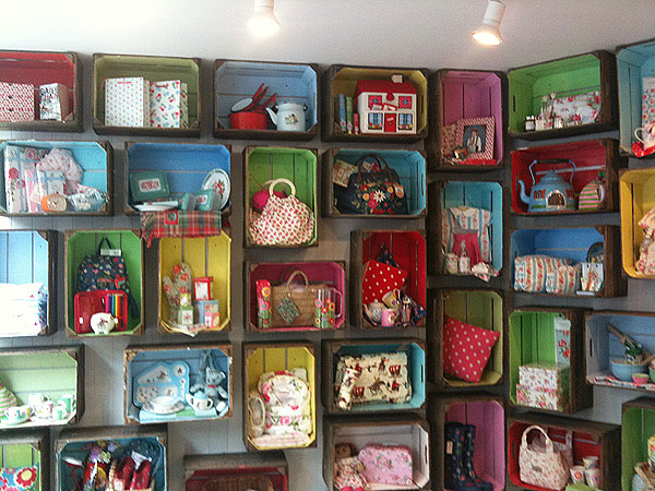
The window crate display continues instore. Bright, colourful, cheap, changeable and highly effective. This gives the front of the store's "decompression zone" a real welcome, a chance to browse before you enter the main store.
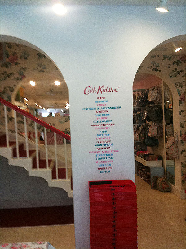
Baskets are placed beneath a simple painted store directory.
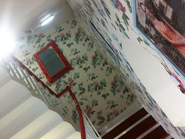
Upstairs, even though it's roped off there's an enticing red bannister and wallpaper to show you how good this could look in your home.
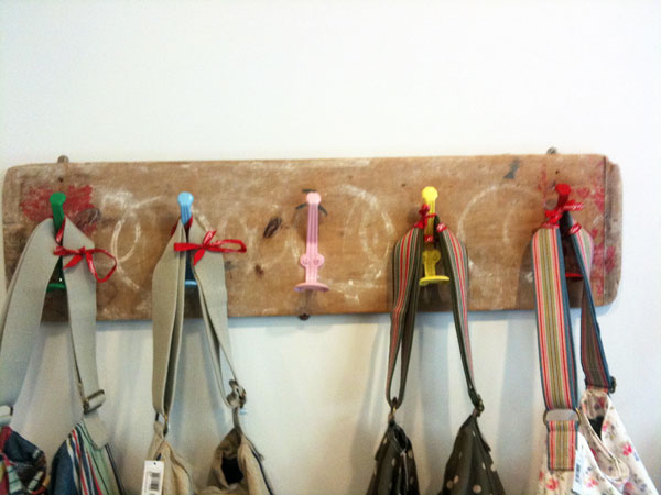
Also in the entrance an old school coat rack. Again bright colours on what appears to be found fittings creates a simple way to showcase products.
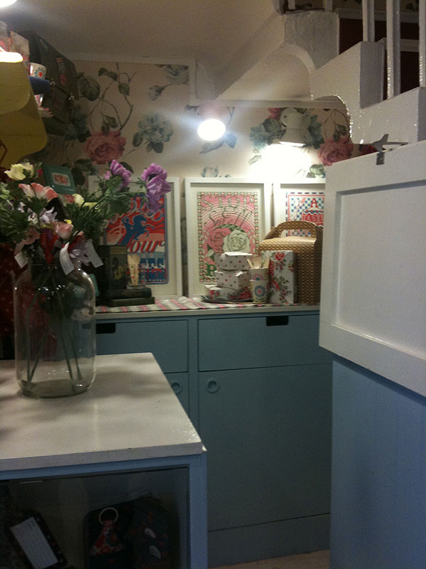
A little staff area beneath the stairs, perfect for gift wrapping and storing purchases to be picked up later.
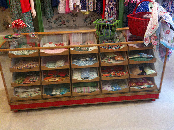
An traditional display case refurbished with a lick of bright paint.
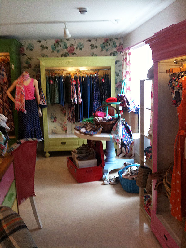
Painted wardrobes and suitcases make for an easy way to show the amazing range of products.
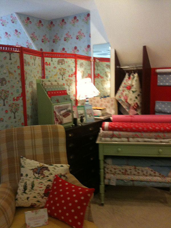
A lit lamp creates a nice little feature in this space next to the made to measure area. A simple screen separates two different shopping areas.
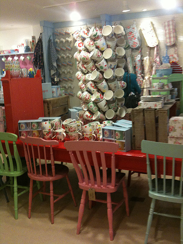
Centre floor unit piled high with goods.
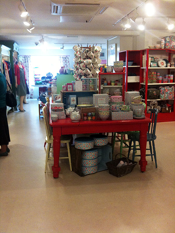
Another view of the centre floor unit, piled high and with more goods beneath the table.
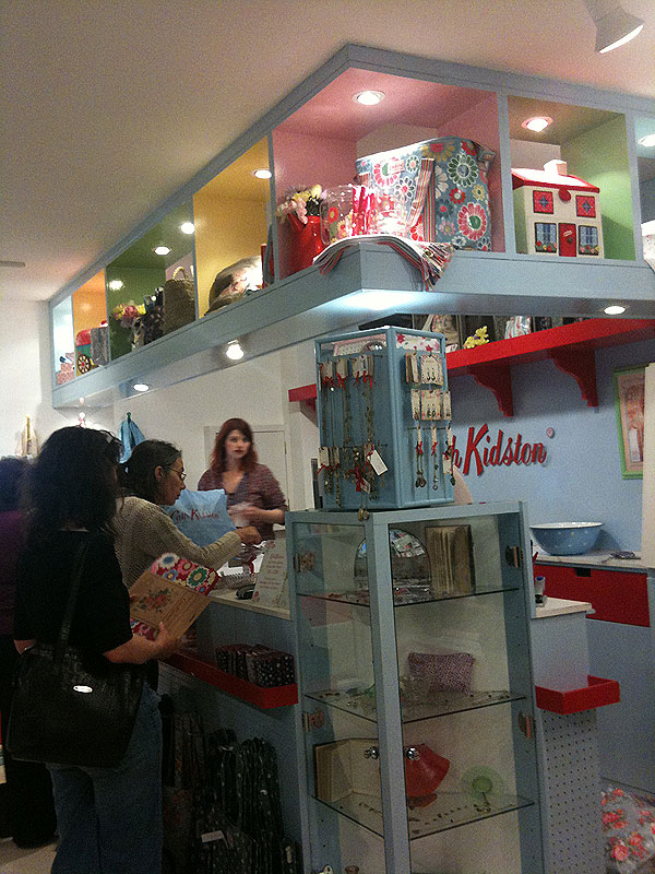
The cash desk is really well thought through with it's own high level display and plenty of cross merchandising including a display case in the centre of the front desk area.
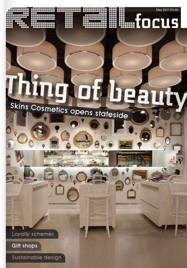
We’re in Retail Focus
This little old blog featured in the May edition of Retail Focus which subscribers can read on line (for free). Well worth subscribing to in particular for their coverage of VM.

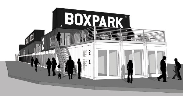
And now … the pop up mall
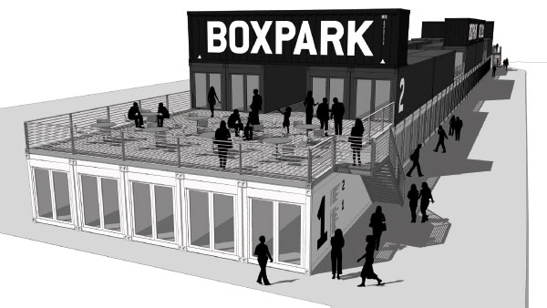
Coming to Shoreditch, London in August 2011 is Boxpark. A pop up mall of 60 containers on two floors located opposite the Tea Building.
More information and a nice little video on the Boxpark website. Definitely worth a visit in the summer to what should be an interesting and original addition to Shoreditch.
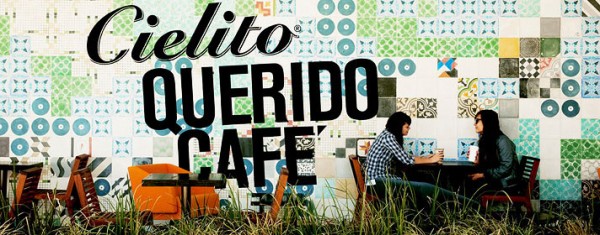
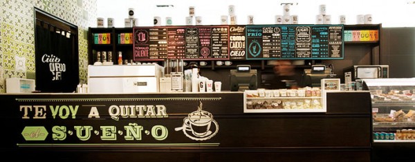
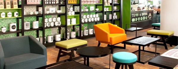
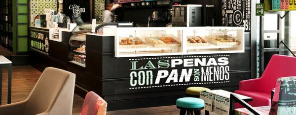
Cielito Querido Café
Very nice Mexican café. So much time and energy has gone into this and a fantastic use of colour and type. Just goes to show you don’t need supersize product images to get your style and flavour across.
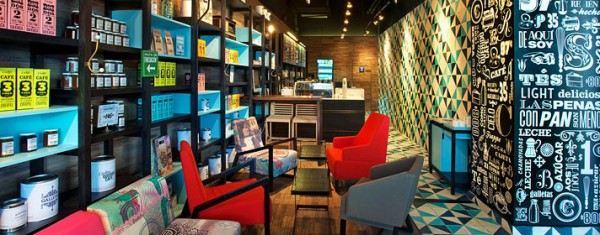
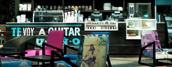
Spotted at The Dieline
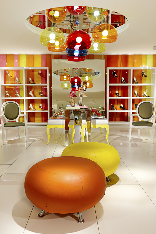
C&A as you’ve never seen it before
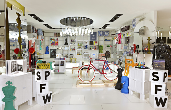
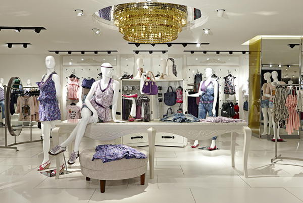
Who knew C&A could look like this. Just shows what a bit of South American pizazz can do. Of particular note are the light fittings just showing how much can be achieved with simple ideas well executed.
Spotted on LSN Global.

