Obsessively interested in everything
Think Quarterly from Google
Google launches Think Quarterly, “a space to take time out and consider what’s happening and why it matters.” This issue is dedicated to data.
[issuu layout=http%3A%2F%2Fskin.issuu.com%2Fv%2Fcolor%2Flayout.xml backgroundcolor=FFFFFF showflipbtn=true autoflip=true autofliptime=6000 documentid=110324123903-e805e6aca0a44b018844511f059058c6 docname=01-data username=ThinkQuarterly loadinginfotext=Think%20Quarterly%20-%2001%20Data width=600 height=368 unit=px]
The new Waitrose website
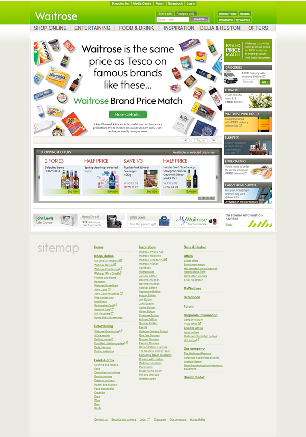
Today Waitrose launched their new website. Overall a more streamlined sophisticated look with more to do on the home page.
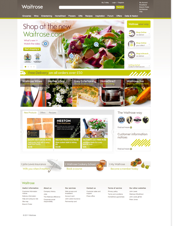
Gone is the enormous site map in the footer replaced with a neater version. Navigation is cleaner and the ‘value’ bright green is replaced with a more elegant textured brown and olive green.
In the details of particular note are the areas on the introductory slideshow where icons give the viewer the option to click and see more information. In the bricks and mortar world, this ‘getting to know the store’ time is called a decompression zone, here on a website this type of interaction as well as the other tabbed layouts beneath the slideshow create a lot of interest on the home page. Also of note is that these longer home pages look good on a vertical iPad. Starting to see more websites that make better use of the lower half of a vertical screen.
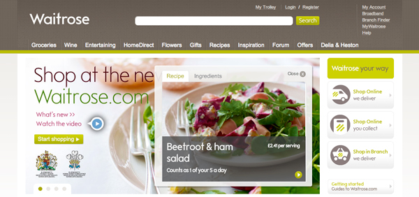
For posterity, below is the old Waitrose website. Here’s the new one www.waitrose.com
Symbology
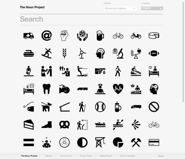
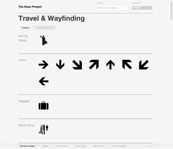
For those amongst you that are semiotically inclined, here’s The Noun Project. A great resource for pictograms with a nice old school slant. Some of them are very reminiscent of British Rail pictograms pre their redesign by Lloyd Northover in 1999. And they’re free, and downloadable, definitely worth bookmarking.
Centre Commercial – Paris
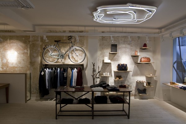
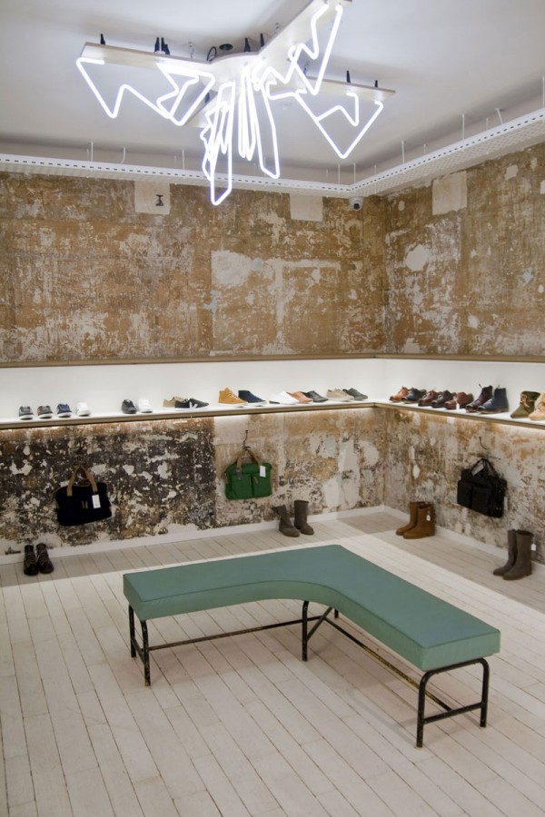
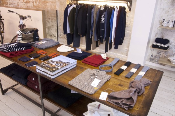
A lovely looking store, Centre Commercial by Veja opened at the end of last year in Paris. The distressed look is to the fore but what makes it stand apart is the excellence of the cross merchandising, beautifully and elegantly done. Also of note is the lighting, little spots on the wall products and an interesting take on neon chandeliers.
Originally from Another Face in the Crowd
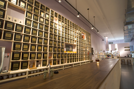
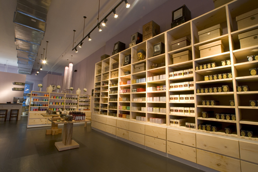
A nice cup of tea and a sit down
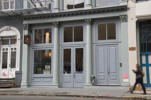
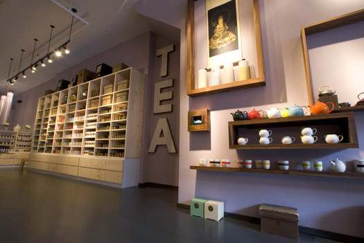
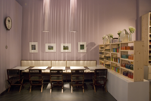
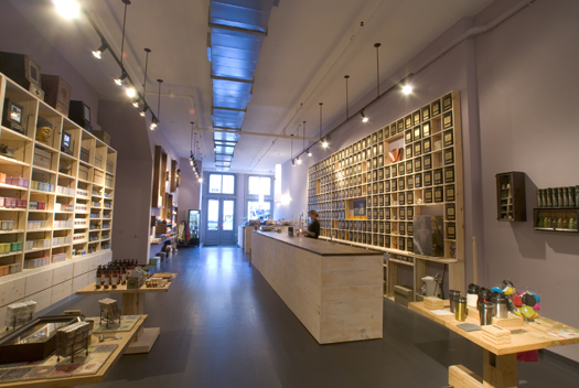
Harney & Sons recently opened in SoHo, New York City.
A tasting bar, over 250 varieties of tea and a beautiful store, what more could any tea connoisseur want?
Cross merchandising the Harvey Nichols way
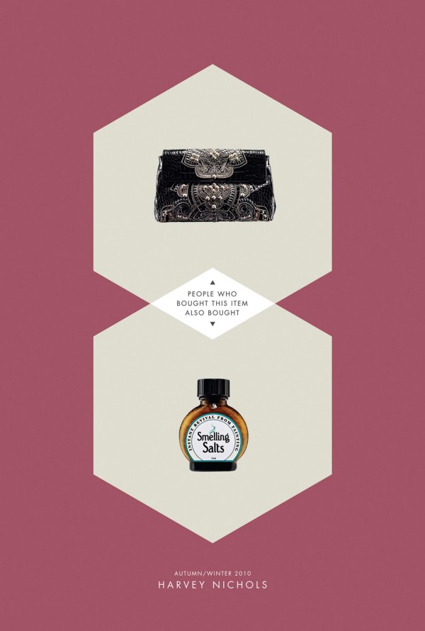
It’s always important to up sell in retail and being obvious about it is not always going to work. Sometime a bit of lateral thinking can go a long way. These ads from Harvey Nichols take cues from ecommerce sites as in ‘people who bought that also bought this’ but really in quality retail this kind of cross merchandising should be the norm, although generally it isn’t.
Three examples here but the full set from the original source on Fuel Your Creativity. Incidentally isn’t this a beautiful colour palette?


D’Espresso – New York
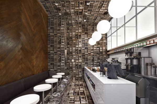
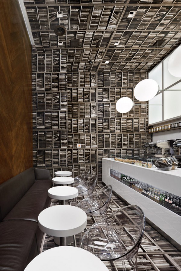
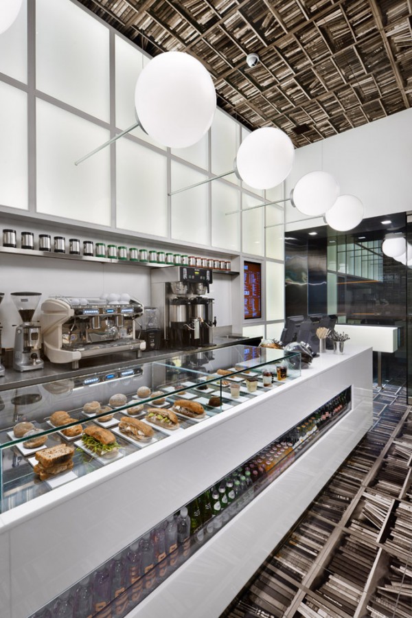
A nice little coffee shop in New York (on Madison Avenue). The optimum word here being little, at only 420 square feet (39 square metres) the designers have done a great job of tricking the eye into making you believe you’re in a larger space. The back wall becomes the floor with the floor and other walls covered in library book wallpaper.
I’m starting to see quite a few smaller shops covering their entire wall space with wallpaper of some description, a quick and easy way to change your look almost overnight, or a bit of theatre if you did it during shopping hours.
Originally from The Cool Hunter.
Holland & Barrett
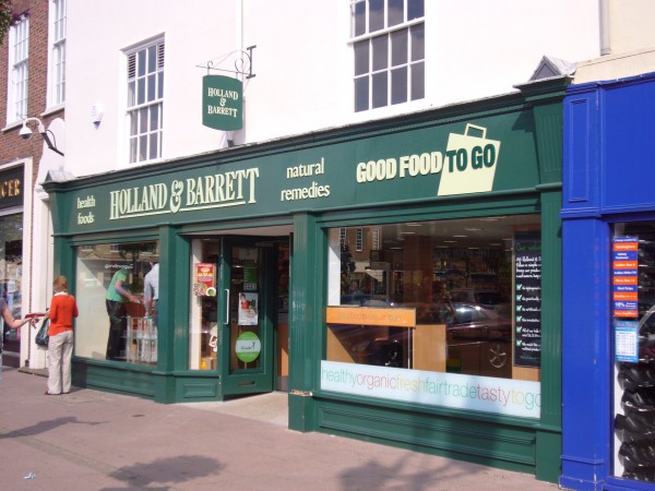
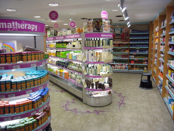
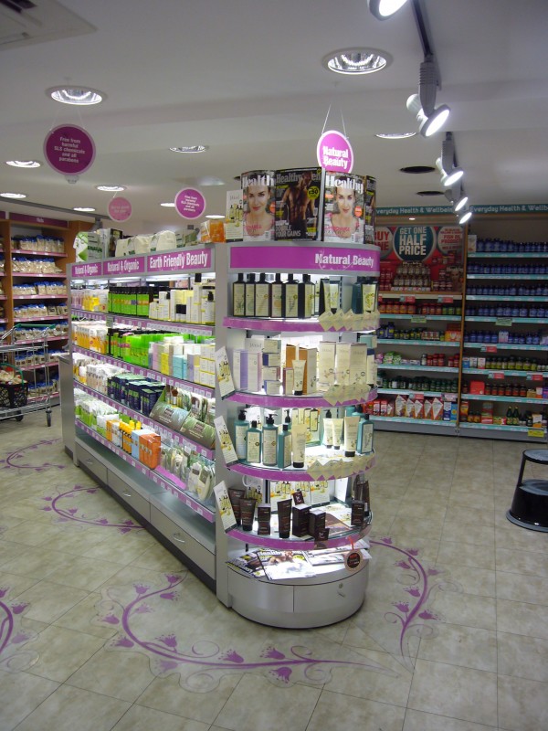
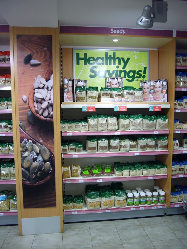
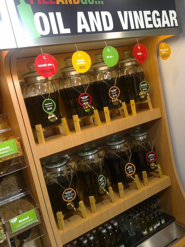
Holland & Barrett opened a new format store back in February in Bury St Edmunds. Eventually we got around to taking a look.
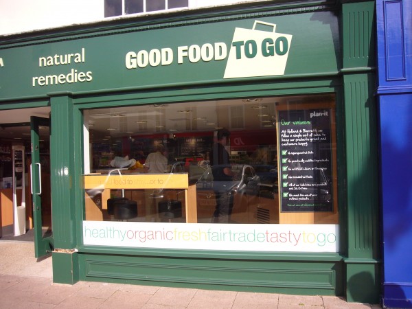
Features included an olive oil station and coffee area and a new Good Food to Go identity which is rather at odds with the traditional Holland & Barrett identity as well as further window graphics which are again mismatched with the Good Food To Go identity. Gondolas are internally illuminated with semi-circular ends which include some high level magazines which are also placed rather strangely on a low level shelf probably just gathering dust. The store itself is well lit and bright in all the right places and according to several sources the customer service is very good which makes a huge difference these days, unfortunately not all retailers have realised this yet.
A couple of these images are from the Rubbish Diet where there is more opinion of the store.
Not for sale
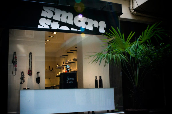
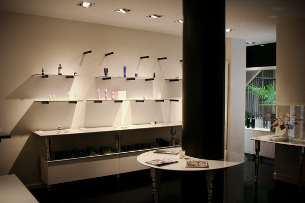
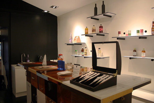
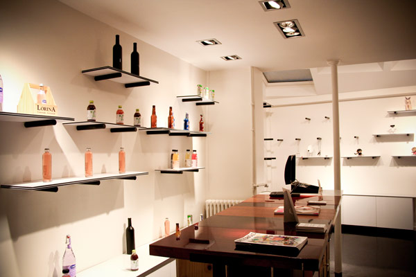
A new store in Paris, the Smart Store where everything is not for sale, but can be tried and tested.
