Retail Safari (part 3) – Zara Home
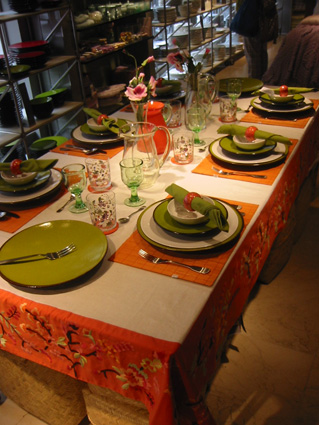
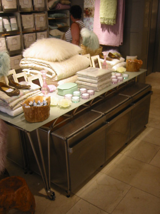
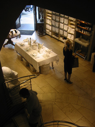
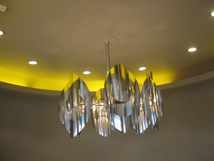
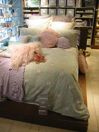
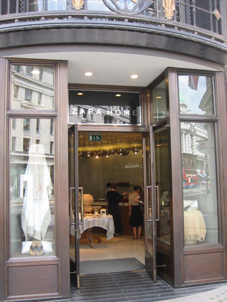
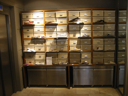
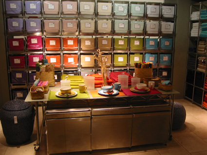
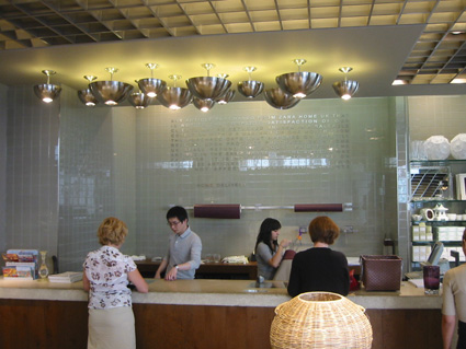
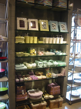
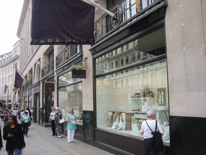
Zara Home is always worth a visit, just to take in the excellent visual merchandising. It just shows how simplicity can be so effective. There’s a few nice features around the store, particularly the staircase with chandelier and yellow lighting, I also like the tiling they’ve used on the cash desk and downstairs. It’s a very calm shop and always pretty busy whenever we’ve been there, the most amazing thing is the product value. You consistently pick up an object and are pleasantly surprised by the price. What looks like at least a £30 plus vase is selling for £6, proof again that you don’t have to put your product in a cheap environment to be a ‘value retailer’.
If you enjoyed this post, please leave a comment or subscribe to the feed and get future articles delivered to your feed reader.

I visited the Zara home store and I loved the wood cladding of the cash desk. Does anyone know what type of wood this is and how it is bonded to the surface?