The new Waitrose website
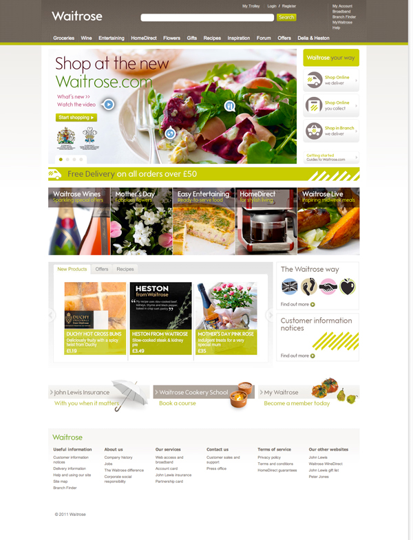
Today Waitrose launched their new website. Overall a more streamlined sophisticated look with more to do on the home page.

Gone is the enormous site map in the footer replaced with a neater version. Navigation is cleaner and the ‘value’ bright green is replaced with a more elegant textured brown and olive green.
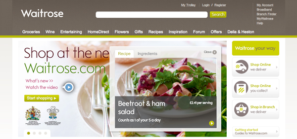
In the details of particular note are the areas on the introductory slideshow where icons give the viewer the option to click and see more information. In the bricks and mortar world, this ‘getting to know the store’ time is called a decompression zone, here on a website this type of interaction as well as the other tabbed layouts beneath the slideshow create a lot of interest on the home page. Also of note is that these longer home pages look good on a vertical iPad. Starting to see more websites that make better use of the lower half of a vertical screen.

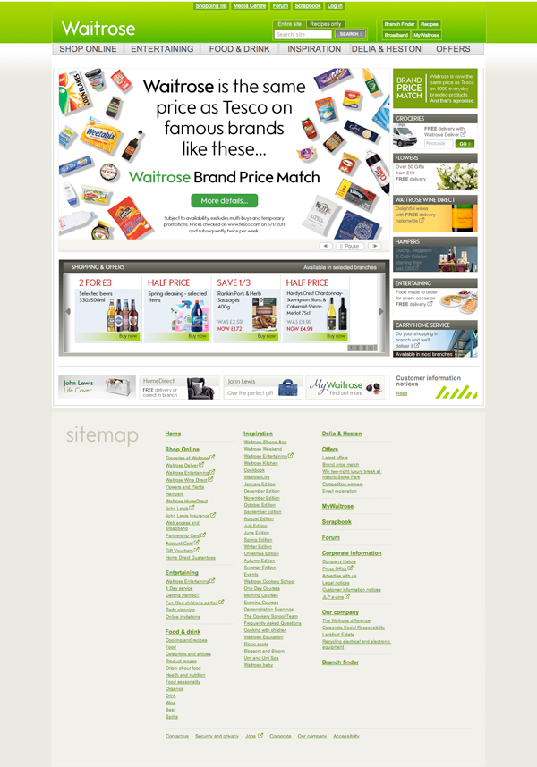
For posterity, below is the old Waitrose website. Here’s the new one www.waitrose.com

If you enjoyed this post, please leave a comment or subscribe to the feed and get future articles delivered to your feed reader.

You might think that it’s an elegant redesign but it’s turning into an unmitigated disaster for waitrose. A quick look at their own forums shows that they are getting almost universal condemnation for these changes because there are so many failures in it’s basic functionality that almost everyone wants the old web site back. The site is slow, crashes, lists products they don;t have, lists duplicate products, makes it nigh on impossible to amend orders, the seach doesn’t work, products are not sorted logically, they have bizarre filter options it repeatedly asks for information it already has.
To be fair there are fewer critical threads on their forums now … but only because they are steadily going through the site and locking the critical threads.
This looks like it is going to become an object lesson in how not to update a web site.