Beurre & Sel
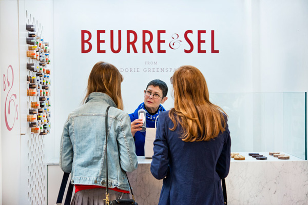
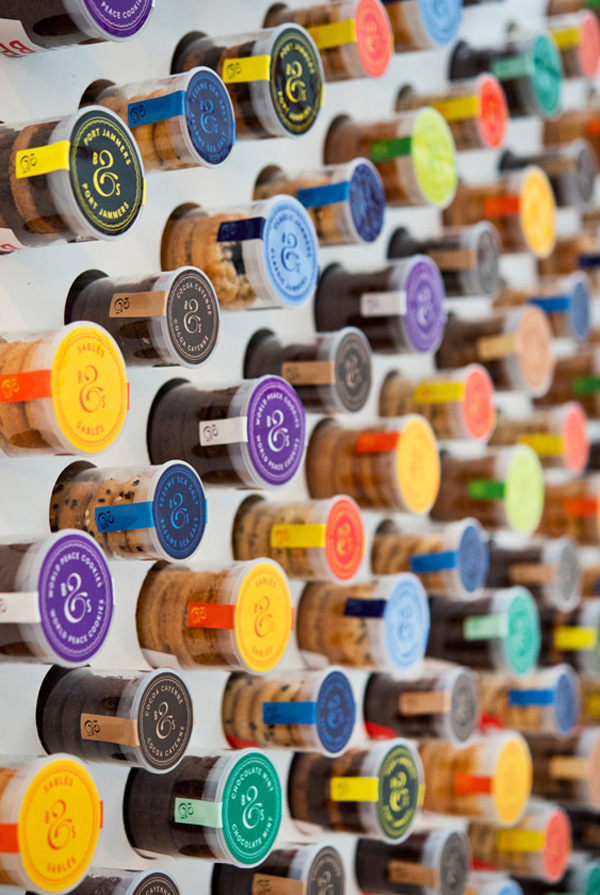
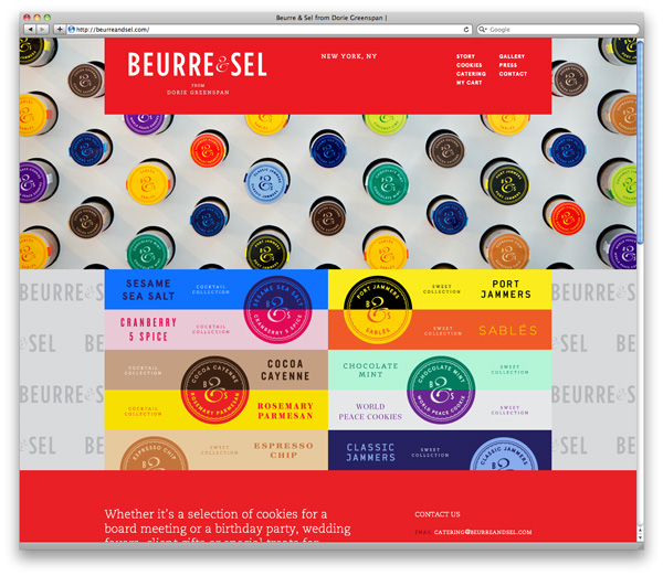
Really like this shop (and website) especially the product display, simple is always best and it’s always good when your packaging creates it’s own point of sale.


More pictures on their website beurreandsel.com
If you enjoyed this post, please leave a comment or subscribe to the feed and get future articles delivered to your feed reader.

This shop does look great, but i cant tell what it sells when I look at the images, which is abit of a worry :S
Some lovely imagery there; obviously the photography is helped by the vibrant colour palette, but still worth a mention in of itself
Design by D+DS architecture office based in New York City.