The big image
There’s a trend in website design to use large background images to add a larger sense of place to screens. These images should be scaleable so they fit into whatever size window you’re using. Some sites have a random rotating image, some are more static. Some use a bit of javascript, or you can just use css and html (our preferred method, see below) and some use flash. Using images this big though means you can’t get away with using photographs or illustrations that are amateur, so the investment in quality images becomes even more important. Also if you use stock images you’ll need to make sure that they’re not ones that have been used by a large amount of websites especially amongst your competitors, that just makes you look cheap.
Because we’re immersed into all things bakery (see Greggs) here we came across this site yesterday for Le Pain de Quotidien, this uses flash to add a random image from a selection every time you visit, refresh the page to see how it works. The photography is fantastic, scales well to fit large screens and loads quickly, all the things you need. This is one of the ways to get across the quality of your goods in a medium when customers can’t touch anything.
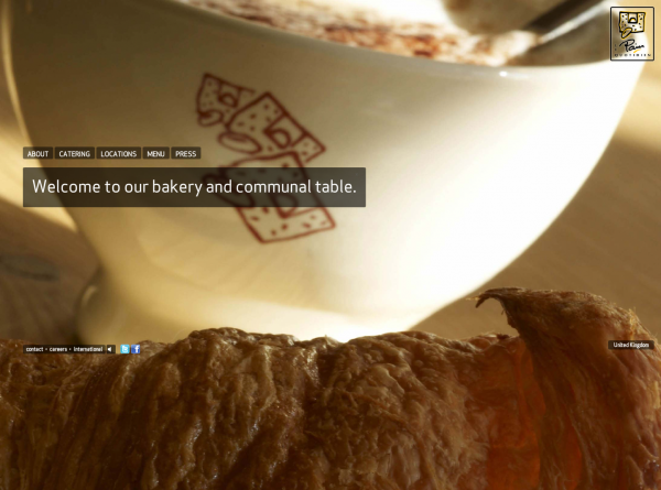
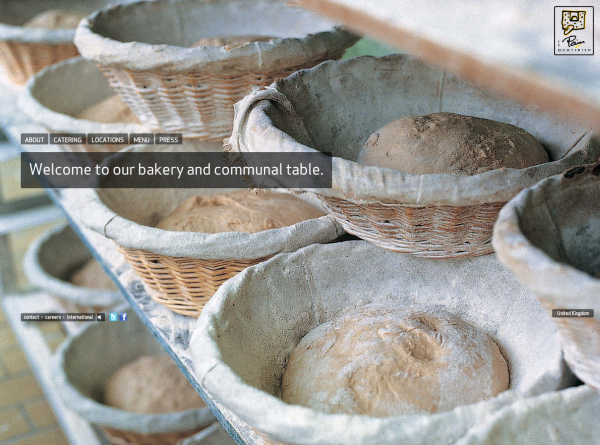
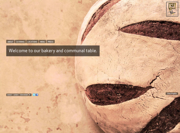
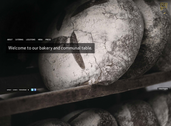
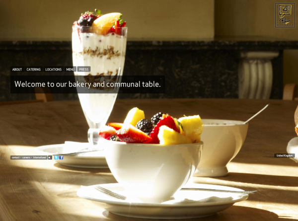
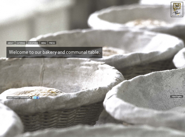
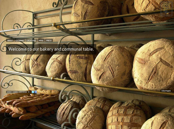
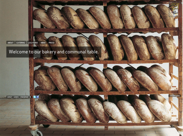
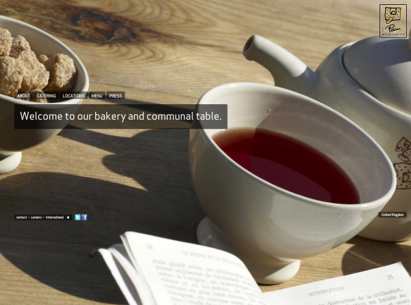
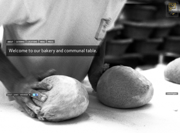

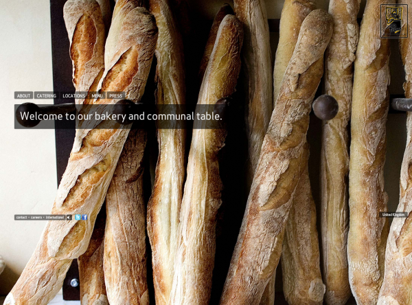
A large background image technique
To create a large image for a background there a few ways of doing it. Here’s our preferred method.
The image
We use images that are around 1500 x 1000 pixels and that have been optimised in Photoshop. If the image isn’t optimised then loading times can be much to long to make using this technique worthwhile.
The css
First add a few lines to your css file.
The first line creates the dimensions for the body of the page, the second adds a dimension for the background image including positioning the image for IE6 (yes, incredibly we still have to work with this), the third line positions the background image for IE7 onwards and other browsers and fixes it in place. The last line adds the position to your content div.
/*** Background image ***/

body, html { height: auto; width:100% }

img.bg { min-height: 100%; min-width: 1024px; width: 100%; position: absolute; top: 0; left: 0; }

html>body img.bg { position: fixed; }

#content { position: relative; }
The html
This is mark up for WordPress. If you’re not using WordPress then change the file path for the image source to whatever works for you.
<body>

<img src="<?php bloginfo('template_directory'); ?>/images/background.jpg" />
<div id="content">

Your content goes in here

</div><!--/end of content-->

</body>
Some examples
Thomas Peatling (this also includes a rotator script that adds a random image from a selection every time a different page is loaded, refresh the page to see it in action)
Thanks
The original post we used is here on CSS Tricks
If you enjoyed this post, please leave a comment or subscribe to the feed and get future articles delivered to your feed reader.
