
Branding = consistency
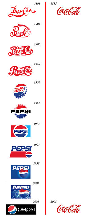
I’ve had this post at the back of mind for a long time and reading this post on We Heart Branding about the difference between Pepsi and Coca-Cola has brought it to the front. It boils down to one things over the years … consistency. Surely though the graph can’t be true? Has Coca-Cola really been the same since 1886? Well it seems so. A little googling brings you to the history of Coca-Cola on their corporate website (worth reading from the point of view about how they gave free samples away at the beginning) and a few other pieces of their logo history.
The main message here is to be consistent. You don’t need to change or tweak your logo every few years, add some shine, shift the colours, make it 3D or use the latest photoshop/illustrator technique tweak or round the corners or add a drop shadow to make it web 2.0 or whatever the latest internet led logo fad is.
What you can do is add to the story, add that extra layer, think how the BBC works. BBC channels exist as a layer beneath the main BBC identity and each has it’s own distinctive style and colour, the idents between programmes serving to give that quick reminder of where you are, the redness and to a lesser extent the circle/globe spreading through the channel, including the news.

If you’re story is wrong or not well thought through or a little frayed around the edges, or perhaps you’re tired of telling it and your customers are tired of hearing it. That’s where you need to change. Although, more often than not it’s not the logo that’s an issue it’s how it’s been used and abused and fallen into the trap of becoming an excercise in design or marketing vanity. You hear it often enough, “let’s tweak the logo”, “can we look at some different colours and typefaces” (how scientific!). How about don’t. How about getting back to the origins of the identity, using the guidelines that it came with and creating a better story that underpins the logo, so your customers can create your brand.
I go along with Jacob Cass on Just Creative Design that a good logo/identity is:
- Simple
- Memorable
- Timeless
- Versatile
- Appropriate
I’ll add into this that a good logo should:
- Provide clear identification
- Stand for your message and values
- Be an internal focal point
- Stand you apart your competition
- Be credible
- Create order
- Create merchandising opportunities (maybe)
More Coca-Cola/Pepsi:
Logoblog.org
Landor – Refreshing an iconic visual identity
More logo design stuff:
Brand New
Logo Design Love
David Airey
If you enjoyed this post, please leave a comment or subscribe to the feed and get future articles delivered to your feed reader.